


What Makes a Good Website? An Honest Guide for Founders About to Hire a Designer
There’s a moment most founders reach where they look at their website, sigh, and quietly wonder if it’s actually doing anything.
You’ve built the business. You’ve found your clients. You’ve shown up online for years. But the website you put together at the start, the one you DIY’d on a borrowed weekend with three browser tabs of YouTube tutorials open doesn’t reflect what you’ve grown into.
You know it needs work. You’re just not sure what good actually looks like.
If you’re here, you’re probably weighing up whether to keep tweaking it yourself or finally hand it to a designer. Before you do either, let me walk you through what actually makes a website good, not from a list someone copied off Pinterest, but from someone who has built a seven-figure business from a kitchen table and now builds websites for founders doing the same thing.
There’s no fluff in this guide. Just the real things that separate a good website from a forgettable one.
A Good Website Has a Job, And It Knows What It Is
This is the first thing most websites get wrong.
Visit ten small business websites in a row and you’ll notice something: most of them are trying to do everything. They want to tell you who the founder is, sell three different services, capture your email, link to social media, share a freebie, and convince you to book a call. All on the homepage. All within ten seconds.
A good website knows what its job is.
Maybe the job is “book a discovery call.” Maybe it’s “sell this product.” Maybe it’s “get on the email list.” Maybe it’s just “establish credibility so people stop second-guessing whether you’re legitimate.”
Whatever it is, every page should serve that job, not compete with it.
When I sit down with a new client at Mustard Seed Studio, the first conversation we have isn’t about colours or fonts. It’s about what the website actually needs to do. Once we agree on that, every design decision becomes clear. You stop asking “do I like this?” and start asking “does this serve the goal?”
If your current site can’t answer the question “what is this website for?” in one sentence, that’s the first thing a designer will fix.
A Good Website Speaks to One Person, Not Everyone
Generic websites are forgettable websites.
When you write copy that’s meant for everyone, it lands with no one. The site reads like a chamber of commerce brochure -technically professional, emotionally flat, completely interchangeable with every competitor.
A good website is written for one specific person.
For your business, that might be the 38-year-old nutritionist who’s been in business five years, has paying clients, but feels invisible online. Or the eCommerce founder who’s outgrown her Shopify site. Or the coach who keeps losing leads to other coaches whose websites look more confident.
When you write to that specific person, something magical happens. Your dream client lands on your homepage and feels like you wrote it just for them. The wrong-fit visitor closes the tab. Both are wins.
If your site speaks to “small business owners” or “founders” or “entrepreneurs,” it’s speaking to no one. Get specific. The right person needs to feel seen in the first sentence.
A Good Website Loads Fast
Here’s an uncomfortable truth: speed matters more than most of the things people obsess over.
The average person decides whether to stay on a website within three seconds. If your site takes longer than that to load, you’ve lost roughly 40% of your visitors before they’ve seen a single word you’ve written.
Google also penalises slow sites in search rankings. So a slow site doesn’t just lose visitors, it loses traffic at the source.
Good websites are built with speed as a non-negotiable. That means:
- Images compressed and optimised before upload (under 200KB each)
- Modern image formats like WebP instead of JPG or PNG where possible
- Minimal use of heavy auto-playing videos
- No bloated themes loaded with features you’ll never use
- Clean code that doesn’t drag
When you hire a designer, ask them about site speed. If they don’t have a clear answer, they’re not thinking about it.
A Good Website Looks Like It Was Made For You
I’m going to say something controversial: a good website is not a template with your logo dropped on top.
There’s a market for templates, I make them myself but a templated website will always look templated. The font choices, the layout patterns, the section structures will be recognisable to anyone who’s seen the original.
If you’re an established founder with a real brand and real revenue, your website should look like yours. Not “this could be anyone’s.” Not “I’ve seen this before.” Specifically, identifiably, undeniably yours.
This is where most DIY websites quietly fail. You can DIY many things in business and still get great results. A website is one of the few things where the difference between DIY and professional is immediately visible and quietly costs you credibility before you’ve even said a word.
That doesn’t mean every business needs a fully custom $15,000 build. But it does mean if your goal is to be taken seriously at a premium level, you need design that matches.
A Good Website Has Clear Hierarchy
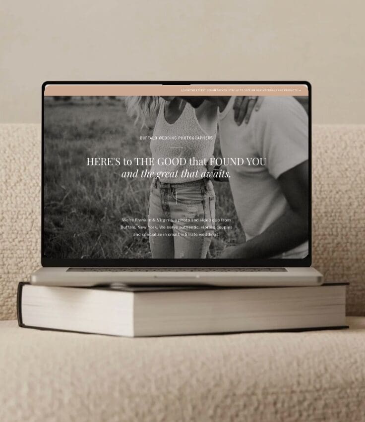
Hierarchy means the eye knows where to go. The most important thing is biggest. The next most important is next biggest. The least important is smallest.
When everything on a page is the same size, weight, and emphasis, nothing stands out. The visitor’s eye doesn’t know where to land, so it lands nowhere. Then they leave.
A good website uses clear visual hierarchy to guide the reader through a story:
- One bold headline that names the problem or promise
- A clear subheading that adds context
- Body copy that delivers the substance
- A single, obvious call to action
Look at any premium brand’s website — Aesop, Loewe, Glossier, the New York Times. The hierarchy is unmistakable. Your eye knows exactly what to read first, second, third.
DIY sites usually have flat hierarchy because there’s no underlying strategy. Designers fix this by making intentional choices about what matters most on every page.
A Good Website Has Strategy Behind Every Page
I run a process at Mustard Seed Studio where before I design a single page, we map out who the visitor is, what state of mind they’re in when they land, and what we want them to feel and do next.
This is the difference between a website that looks nice and one that actually works.
For example: if someone lands on your About page, they’re not there to read your résumé. They’re there to decide if they like you enough to hire you. So the About page shouldn’t list credentials in chronological order — it should tell a story that builds connection and trust.
If someone lands on your Services page, they’re trying to figure out which package fits them. So the page shouldn’t lead with how amazing you are — it should help them self-select with clear, specific descriptions of who each service is for.
Every page has a job. Every job has a user. Every user has a state of mind. Good websites are designed with that depth of thought layered into every decision.
This is what you’re paying a strategic designer for. Not just pretty layouts. Decisions made with purpose.
A Good Website Converts Quietly
There’s a flavour of website that screams. Pop-ups, sticky banners, exit-intent overlays, three different CTAs on every screen, urgency timers, bold red discount tags.
These websites convert in the short term, but they also exhaust visitors. They feel manipulative. They make premium clients quietly back away.
A good website converts quietly.
That means:
- One clear, prominent CTA on every page
- Strategic placement of secondary CTAs without overwhelming
- Genuine social proof (real client wins, real testimonials, real outcomes)
- Friction removed at every step – booking should take one click, not five
- A clear path from “just landed” to “ready to enquire” without being chased
Premium clients respond to confidence, not pressure. The most beautiful websites in the world don’t beg. They invite.
A Good Website Is Built to Grow With You
Here’s something most DIY builders don’t think about until it’s too late: your website needs to be able to grow with your business.
That means:
- A platform you can update yourself without calling a developer for every small change
- A foundation that can scale when you add new services, blog posts, products, or pages
- A backend that’s organised, documented, and easy to navigate
- A mobile version that works as well as the desktop version
The biggest mistake I see is founders investing in a site that looks great at launch but becomes a nightmare to maintain six months later. Either the platform was wrong, the build was overly complex, or no one trained them on how to manage it.
A good designer doesn’t just build your site, they hand it over in a way that empowers you to own it.
A Good Website Gets Found
There’s no point having the most beautiful website in the world if no one ever finds it.
Search engine optimisation isn’t an add-on. It’s foundational. Every good website should have:
- Page titles and meta descriptions written for both humans and Google
- Clean URL structures (your blog post should live at
/field-notes/post-name, not/p=2847) - Image alt text and properly named files
- Clear heading hierarchy (one H1, then H2s and H3s in order)
- Internal linking between related pages
- A blog that targets real questions your dream client is searching
- Mobile optimisation (Google indexes mobile first)
- A connected Google Search Console account
A designer who doesn’t talk about SEO isn’t thinking about how your site will perform. They’re thinking about how it will photograph.
So What Makes a Good Website?
Strip everything else away, and a good website does three things:
- It works hard. Loads fast, gets found in search, converts visitors into clients, and continues working long after launch day.
- It feels like you. Doesn’t look templated, doesn’t sound generic, doesn’t apologise for being premium.
- It’s built with strategy. Every page, every line of copy, every design decision has a reason behind it.
If your current site does all three, keep it.
If it doesn’t, it’s time to invest in one that does.
Ready to Build Yours?
If you’ve read this far, you’re not just curious – you’re already thinking about what’s next.
At Mustard Seed Studio, I work with founders who have built something real and are ready for a website that finally reflects it. Strategy-led, beautifully designed, built to grow with you.
Take the first small step: Book a free discovery call. We’ll talk about your business, your goals, and whether we’re the right fit for each other. No pitch, no pressure – just an honest conversation.
Leave a Reply


FEATURED PROJECTS | FEATURE PROJECTS | FEATURE PROJECTS | FEATURE PROJECTS
FEATURED PROJECTS | FEATURE PROJECTS | FEATURE PROJECTS | FEATURE PROJECTS |FEATURED PROJECTS | FEATURE PROJECTS | FEATURE PROJECTS | FEATURE|


RHIANNAN - 4 LITTLE DREAMERS, MELBOURNE, AUSTRALIA
Joanne took time to understand my business needs and strategy that's already begin making a difference. Joanne's communication was great and explained to me in a way of things I can understand. She went above and beyond and helped me with anything I needed at anytime of the day. I HIGHLY RECOMMEND and will continue to with Joanne again.
" I couldn't be happier with the results! "
ALISON - FOR THE LOVE OF MUM, SYDNEY, Australia
Joanne approaches her work with so much care and intention. She doesn’t just design, she really understands how a business works and what it needs. The process felt collaborative, thoughtful, and incredibly supportive from start to finish. If you're looking for someone who has experience as a successful small business owner, who is skilled and great to work with, Jo is a perfect choice!
" Jo is a perfect choice if you want someone to build you a brand that represents you. "
It was easy so easy to work with Joanne. After our first brief, she took my thoughts and had made my business now look very professional. She built me a website for my coaching business side of things and merge it nicely with my Muscle Culture merchandise. She went beyond surface-level design, and created a website that finally feels clear, aligned, and easy to share.
" I had grown 317% in my social media reach."
Naz- muscle culture, melbourne, australia
Working with Jo from The Mustard Seed Studio has been one of the best investments I’ve made for my business. She helped me with brand strategy, ads and emails that not only looked beautiful but were strategic and business-minded too. She’s wonderful to talk to, really understands brands and marketing. I walked away feeling so much clearer and more confident in my business and brand direction.
" She was honest, practical and completely no fluff. "
KAREN - MONTESSORI MATES, melbourne, australia


Be the first to comment